

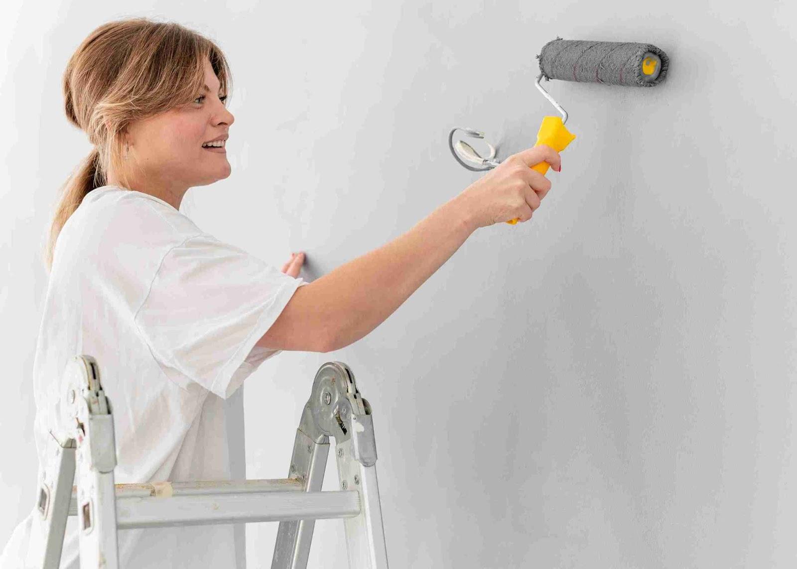
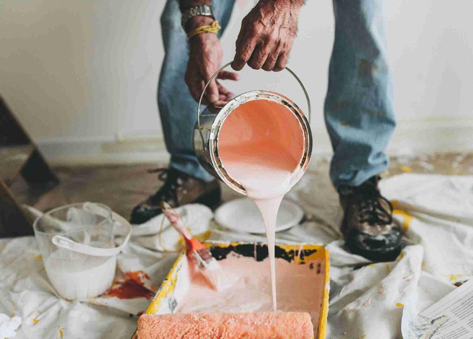
We’ve seen it countless times—homeowners panicking when they see paint options at their local paint shop. Choosing the right interior paint for your walls shouldn’t feel like solving a math equation. Whether you’re refreshing a tired living room or revamping your entire home, smart paint choices will save you time, money, and those “I wish I’d picked the other colour” regrets.
Table of Contents
Interior Paint Types and Quality
The foundation of your painting project begins with choosing the right type of interior paint. This decision influences everything from how easily it applies to how it will hold up against the sticky fingers of small children.
Paint Types for Your Walls
- Water-based interior paints have become one of the best options for most Australian homes. These paints (including latex and acrylic varieties) dry quickly in our climate, produce fewer fumes, and you can clean up spills with just soap and water. We’ve watched these paint formulations improve dramatically over the past decade, now offering durability that rivals their oil-based counterparts. They work brilliantly in bedrooms, living areas, and hallways where you’ll appreciate the lower odour.
- Oil-based interior paint options still deserve consideration for specific situations. Their slower drying time allows the paint to level beautifully, creating a smoother finish with minimal brush marks. They form a harder, more resilient surface, making them suitable for high-moisture areas or surfaces that cop a beating. Mineral spirits are needed for cleanup, and ventilation is essential to air out the space during application.
- Eco-friendly and low-VOC interior paint formulations have transformed the market for health-conscious homeowners. Traditional products release chemicals that can trigger headaches and breathing problems. Today’s low and zero-VOC paints have massively reduced these emissions without compromising performance. Consider these for nurseries, bedrooms, and homes where family members have asthma or sensitivities.
Paint Quality You Can See and Feel
Many clients often ask us if premium paint is really worth the extra money. The honest answer? It depends on your space, but you can immediately tell the difference when working with quality paint.
Higher-quality paint contains more pigment and superior binders, delivering better coverage and longevity. You’ll notice the difference during application when premium paints cover in fewer coats. More importantly, you’ll appreciate it years later when your walls continue to resist fading or staining.
For busy family homes, investing in premium paint typically pays for itself. The washability means your walls withstand regular cleaning without the colour fading or rubbing off. Premium paints also typically resist mould growth better. Therefore, it’s perfect for our humid Australian bathrooms and kitchens.
That said, budget options make perfect sense in certain scenarios. If you’re refreshing a rental property, planning to redecorate soon, or painting a rarely-used guest room, a mid-range paint might serve you well.
Choosing the Interior Paint Finish for Different Rooms
| Finish Type | Appearance | Durability | Best Applications | Notes |
| Flat or Matte | Soft, velvety appearance that soaks up light | Low washability, doesn’t handle scrubbing well | Ceilings, low-traffic areas, formal dining rooms, main bedrooms | Excellent for disguising wall imperfections, especially in older homes |
| Eggshell | Subtle sheen, between flat and glossy | More washable than flat | Living rooms, family rooms | Sweet spot between elegance and practicality |
| Satin | Pearl-like finish with a gentle glow | Good durability, stands up to regular cleaning | Most walls, children’s bedrooms, busy family areas | Versatile go-to finish recommended by many professional painters |
| Semi-gloss | Noticeably reflects light, making colours appear richer | Highly washable, resistant to moisture | Kitchens, bathrooms, laundry rooms, woodwork, trim | Top choice for moisture-prone areas |
| High-gloss | Mirror-like surface | Extremely durable and easy to clean | Doors, trim, cabinetry, occasional feature walls | Reveals every wall imperfection, requires meticulous surface preparation |
Making Confident Colour Choices
Colours affect our mood and perception more than most people realise. Warm tones like reds, oranges, and yellows tend to energise spaces. We’ve seen them completely transform large, cold-feeling rooms into inviting, intimate areas. Meanwhile, cool tones such as blues, greens, and purples generally create a calming atmosphere and can make compact rooms feel more spacious.
The colour wheel isn’t just for designers so don’t be intimidated to use it. It’s a practical tool for anyone choosing paint. Complementary colours (those opposite each other on the wheel) create dynamic spaces with visual energy, and analogous colours (those next to each other) create harmonious, relaxing spaces that flow naturally.
Additionally, pay special attention to undertones in your interior paint. This is the subtle hues that you see differently depending on your lighting. A white interior paint might appear warm and creamy in morning light but stark and clinical by evening. Grey interior paints often surprise homeowners when blue, green, or purple undertones become apparent once on their walls. Knowing these hidden qualities helps prevent those “this isn’t what I expected” moments after painting.
Light Effects on Interior Paint Perception
Light transforms colours in ways that often surprise homeowners. The same interior paint can look dramatically different depending on natural light, artificial lighting, and even which direction your windows face.
- North-facing rooms in Australia receive cooler, bluer light that can make colours appear more muted. To counter this effect, we often suggest warmer tones or slightly more saturated hues than you might use elsewhere.
- South-facing rooms benefit from warm, golden light for much of the day, improving warm colours and potentially making cool colours appear duller. Even white can take on a warmer appearance in these spaces.
- Artificial lighting also changes how people perceive interior paint. Traditional incandescent bulbs cast a warm light, while fluorescents typically create a cooler effect. LED lighting varies widely, so we always recommend testing your paint samples under the specific fixtures you actually use.
- The time of day dramatically alters colour perception too. That perfect grey paint might look sophisticated in morning light but take on an unwanted green cast by evening. Always view your samples at different times before committing.
Other Architectural and Physical Considerations
Your home’s physical characteristics should guide your interior paint choices.
- In smaller rooms, lighter colours generally create a sense of spaciousness. Meanwhile, darker hues can make a room feel more intimate. However, we’ve also seen stunning small rooms in rich, deep colours that feel wonderfully cosy rather than cramped.
- Ceiling height affects our perception of space too. A tall ceiling painted in a slightly darker shade than the walls can make an oversized room feel more balanced. Conversely, extending your wall paint a few inches onto the ceiling can make a low ceiling feel higher.
- Architectural features like ornate cornices, picture rails, or built-ins offer opportunities to highlight your home’s character. Painting these elements in contrasting colours or different finishes can accentuate their beauty.

Finding Inspiration and Narrowing Choices
Collecting images that appeal to you from magazines, social media (we love using Pinterest), or home improvement websites. Often, there’s a pattern that we notice when clients show us their inspiration. Perhaps they consistently save images of serene blue rooms or spaces with bold accents.
Digital tools have truly changed the game for how we visualise possibilities. Many companies now offer apps that let you upload photos of your room and virtually “paint” the walls. While not perfectly accurate, these tools provide a helpful preview of how different colours might look in your space.
Do Not Skip the Sampling Process
Never skip testing samples because it’s the single most important step in selecting the right interior paint. Remember: colour chips and digital representations simply cannot capture how paint will appear in your specific environment.
Purchase sample pots of your top interior paint contenders and apply them generously. You need large patches (at least 50cm square) to evaluate the colour best. Paint samples on multiple walls within the same room, as light conditions vary even within a small space. Don’t rush this process. Live with your samples for several days before making your final decision. The time invested upfront prevents costly mistakes and disappointment.
The Bottom Line
While selecting the right interior paint is not a walk in the park, be prepared to balance technical considerations with personal preferences. Understanding the options available and how they’ll perform in your space helps you make choices that provide lasting satisfaction. Interior paint changes your home more cheaper than almost any other decorating option.
At Paintistry, we’re passionate about helping you make the best decision to achieve results you’ll love for years to come. Contact our team today for expert guidance on your next interior painting project.
